
This tutorial is designed for totally beginners.

On this ever-changing internet there are a many trends different from each other. Even though most of the designers are trending towards Flat, Metro style designs, Glossy designs are still in use by many media all over the world. Other than with any other software, creating glossy designs is quite easy with Adobe Photoshop. Let's learn how to do that with this simple tutorial.
1. Open up Adobe Photoshop
I will be using Adobe Photoshop CS5 for this tutorial. Don't turn back now! For this tutorial, older versions can also be used. This tutorial is not about a feature you find in Photoshop. This tutorial will help you to learn how to use quite simple tools which were available even in earlier versions of Photoshop, to create something interesting. Let's move on.
2. Create a New Document
Dimensions are up to you to think of. I have used a document with dimensions 600x300, with a resolution of 72 pixels per inch.

Why just 72 pixels per inch? I'm creating a button, and in most cases buttons will be created to be displayed on screens. For example when you create a button for a web page, your users view it through their computer monitor. Therefore there is no need of having a pixel depth higher than 72 for this purpose. If you are creating a button or some other Graphic designing element to be used for print media, then you will need to have a resolution meeting a minimum of 300 pixels per inch. If you have seen Graphics designs in print media which have lost their precision and have a blurry look, one of the most possible reasons is using a lower resolution in creating the graphics. But keep in mind that if you are designing for an high definitions screen, let's say you are designing for a iPhone retina display, then you'll have to design your graphics at a resolution of 326ppi.
Let's revise this a bit,
- 72ppi - Good enough for webpages
- 96ppi - Mostly used for presentations, etc.
- 300ppi - Required for designs used for print media to take a decent quality print.
- 326ppi - Required for graphics on iPhone retina display.
3. Too much of crap! Let's get on to work now.
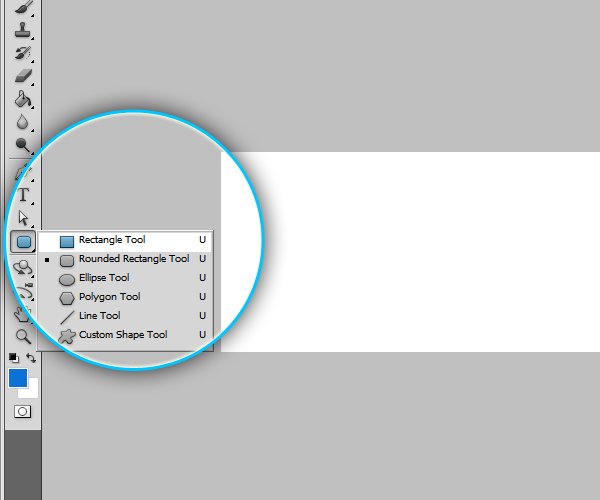
Create a Rectangle, a simple rectangle, choosing the Rectangle Tool on the Tools Panel on left.
You can change the color of the rectangle in several ways,
- Before you draw you can change the Foreground color on the Tools Panel on left. Double click the foreground color.

- Also before you draw you can choose a color with the Swatches palette or the Color Palette on the right.

- Or after drawing you can change the color by a double click on the color preview on the Layers pane

4. Double-click on the Empty area on the layer (on the Layer Panel) to Open up the Layer style dialog box.

You can open up the Layer Style dialog box through Right-Click on Layer > Blending Options..

You may play with the controls on this dialog and experiment on what you can design. To add an effect turn them on with their check box, and try changing the values in each property.
These are the changes I'm doing for this button on this tutorial.
| Inner Shadow | Opacity | 75% |
| Distance | 0 px | |
| Size | 4 px | |
| Inner Glow | Blend Mode | Overlay |
| Opacity | 100% | |
| Choke | 30 px | |
| Size | 5 px | |
| Gradient Overlay | Blend Mode | Linear Light |
| Opacity | 10% |
I didn't change the other values, kept them unchanged with their default values.
5. Now we'll move on the glossy part
Create a new layer to add the gloss.

With that newly created layer selected, select the Brush Tool from the Tools panel.

Right click on the canvas to change brush settings and set the hardness to 0.

Click somewhere in the middle of the screen once to place the brush on the screen. This will be used as the gloss in our button.
With the layer of containing our Gloss element selected, Check the Show Transformation Controls option in the tool options on the top, to show up the transformation tools.

Or you can do the transformations easily by pressing Ctrl + T on your keyboard.

Now Scale and Transform the gloss as in the figure, so that it looks like the button is glowing.

Press Enter to confirm the transformations.
And then you can change the Blend mode of the layer to Overlay.

Now we are on to the most important part.. So keep focus.
We have to mask the gloss, within the rectangle. To do that simply we can Click on the border between the 2 layers, with Alt key pressed. You can see the mouse cursor changes when you are ready to do that.

Now the rest is simple.
Duplicate the layer you just masked. There are several ways to do that.
You can drag the layer downwards with the Alt Key pressed.

You can drag the layer in to the Create New Layer button on the Layer Panel.
Or simply you can go through (on the standard menu bar) Layer > Duplicate Layer... > OK to duplicate the current layer.

Or in a much simpler way you can just right click on the layer and click Duplicate Layer to duplicate the selected layer.
Duplicate it several times and position to create a decent glossy look.

6. Adding a Glass like look to the Button
Draw a rectangle as you did above with White as the Foreground color.
And change it's Blending Style to Overlay.
Make sure you mask it as you did above.

You can simply drag that layer between the already masked layers to mask that layer as well.
Now set it's opacity to somewhere around 20%-30%.

Now add some text to the button using the Text tool on the Tools Panel.

Let's add an outer glow to the text layer to give a touch. Now as you know how to add layer styles, through blending options, as you did above for the Button's rectangle, try adding an Outer glow by your own. Experiment with it.

What I have added on the text looks like this.
7. Adding a slick shadow.

To give this Graphic Design a finishing, I'll add a shadow beneath the button.
Do you remember how I added a glow, through clicking with the Brush tool, setting it's hardness to 0.
I'm going to add the shadow in the same way I did for those glowing elements. But this time I'll have to use Black as the foreground color. You know why I have to use black in this case. ;)
And make sure your layer is below all the necessary layers.
Transform your shadow a bit and manage to create a nice looking shadow.
8. Saving your Source files for clients.
You can add a Solid fill layer above all the layers, before saving your files. This reduces the file sizes, which results in faster uploads and downloads. To view and work on the Source file you can toggle the visibility by clicking on the 'eye' icon, on left side of the layer.

We are done!

This is my final preview of what I have done since now, manipulating and changing some effects we have already learned through this tutorial. Take a look and see if you can get to create something better than this!
Do you think you could do better with the Photoshop Source file? That sounds great! There you go.. you can download the complete Photoshop Source File from here at the downloads page on this blog. Feel free to use it at your own will. If you come up with any questions, ask them out in your comments!


No comments:
Post a Comment